Best Glass website with html and CSS
Today we are creating a Glass website with Html and CSS 3 . This is a beginner friendly website and is easy to modify too. Some of the key points we can learn from this is the structure of the Html . From CSS we learn to use how to style the page and also to limit the page size and make it scrollable using the overflow-X property .
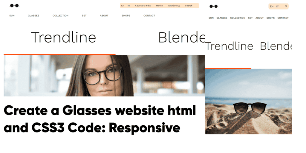
In this blog, we are creating a website with a navigation, hero section and image content with scrolling feature. We will use HTML for structure and CSS for styling, including responsiveness for mobile devices.
Why Build a website with HTML and CSS3 only?
We should be able to build websites with only HTML and CSS as it is easier and very much for beginners. Just think about starting small and slowly getting used to structuring Html and Styling with CSS in a very systematic manner. This website building will help you get familiar with some new CSS properties . Also we have made this website Responsive so you will also learn to do that . Play around with this code and learn .
Html Code-
<!DOCTYPE html>
<html lang="en">

    <head>
        <!-- learn about flex-shrink : 0 and scroll bar and its position overflow-x : auto on the same class or id  -->

        <meta charset="UTF-8">
        <meta name="viewport" content="width=device-width, initial-scale=1.0">
        <link rel="stylesheet" href="style.css">
        <link href="https://cdn.jsdelivr.net/npm/remixicon@4.3.0/fonts/remixicon.css" rel="stylesheet" />
        <title>Trendline</title>
    </head>

    <body>
        <div id="Container">
            <div id="nav">
                <div id="nav-part1">
                    <span>.</span>
                    <div class="circle"></div>
                    <SPAN>-</SPAN>
                    <div class="circle"></div>
                    <span>.</span>
                </div>
                <div id="nav-part2">

                    <h4>EN <span>LT</span> </h4>
                    <h4>Country : Laughtale</h4>
                    <h4>Profile</h4>
                    <h4>Wishlist(12)</h4>
                    <h4>Search</h4>
                    <h5><i class="ri-menu-3-line"></i></h5>
                </div>
            </div>
            <div id="nav2">
                <h3>SUN</h3>
                <h3>GLASSES</h3>
                <h3>COLLECTION</h3>
                <h3>SET</h3>
                <h3>ABOUT</h3>
                <h3>SHOPS</h3>
                <h3>CONTACT</h3>
            </div>

            <div id="content">

                <div id="text-content">

                    <div class="elem">

                        <h1>Trends</h1>
                    </div>
                    <div class="elem">
                        <h1>Blends</h1>
                    </div>
                    <div class="elem">
                        <h1>Ray Walker</h1>
                    </div>
                </div>
                <div id="image-content">
                    <img src="https://images.unsplash.com/photo-1513673054901-2b5f51551112?q=80&w=2070&auto=format&fit=crop&ixlib=rb-4.0.3&ixid=M3wxMjA3fDB8MHxwaG90by1wYWdlfHx8fGVufDB8fHx8fA%3D%3D"
                        alt="">
                    <img src="https://images.unsplash.com/photo-1473496169904-658ba7c44d8a?q=80&w=2070&auto=format&fit=crop&ixlib=rb-4.0.3&ixid=M3wxMjA3fDB8MHxwaG90by1wYWdlfHx8fGVufDB8fHx8fA%3D%3D"
                        alt="">
                    <img src="https://images.unsplash.com/photo-1570993492880-e8b3bfd5e100?q=80&w=2070&auto=format&fit=crop&ixlib=rb-4.0.3&ixid=M3wxMjA3fDB8MHxwaG90by1wYWdlfHx8fGVufDB8fHx8fA%3D%3D"
                        alt="">

                </div>
            </div>

        </div>


    </body>

</html>
After structuring the Html file in the above given manner, this is the result.-

This looks pretty boring we know , but the Html is structured in such a way that it is easy to use Flex-property of CSS . Now Let’s begin to style this website.
CSS Code-
@import url('https://fonts.googleapis.com/css2?family=Work Sans:ital,wght@0,100..900;1,100..900&display=swap');

* {
    margin: 0;
    padding: 0;
    box-sizing: border-box;
    list-style: none;
    text-decoration: none;
    font-family: work sans;
}

html,
body {
    width: 100%;
    height: 100%;
}

#Container{
    width: 100%;
    height: 100%;

}

#nav {


    width: 100%;
    height: 80px;
    display: flex;
    justify-content: space-between;
    align-items: center;
    padding: 0 50px;


}
span{
font-weight: 900;
}

#nav-part1 {
    display: flex;
    justify-content: center;
    align-items: center;
    gap: 2px;


}
#nav h5 i{
    display: none;
}

.circle {
    width: 25px;
    height: 25px;
    background-color: #111;
    border-radius: 50%;


}

#nav-part2 {
    display: flex;
    justify-content: center;
    align-items: center;
    gap: 40px;
    background-color: bisque;
    padding: 10px;
    border-radius: 10px;
}

#nav-part2 h4 {
    font-weight: 16px;
    font-weight: 400;
}


#nav-part2 h4 span {

    color: #9e9a9a;
    margin-left: 20px;


}


#nav2 {
    height: 70px;
    width: 100%;
    display: flex;

    align-items: center;
    gap: 100px;

    padding: 0 50px;


}

#nav2 h3 {

    font-weight: 400;
    text-transform: uppercase;

}

/* hero-section */

#content {
    width: 100%;

    height: calc(100% - 150px);

}

#text-content {
    height: 45%;
    width: 100%;

    display: flex;
    flex-wrap: nowrap;
    overflow-x: auto;
    /* overflow-x: auto    --- automatically take the specified height and with from the parent that is width is 100% and not more than that which induced the scroll  */


}

#text-content::-webkit-scrollbar {

    background-color: transparent;
    height: 7px;


}

#text-content::-webkit-scrollbar-thumb {


    background-color: orangered;

}

.elem {

    height: 100%;
    width: 60%;


    flex-shrink: 0;
    display: flex;
    align-items: center;
    justify-content: center;


}


.elem h1 {

    font-size: 7.5vw;
    font-weight: 300;
}

#image-content{

    height: 60%;
    width: 100%;

    display: flex;
    overflow-x: auto;
}

#image-content::-webkit-scrollbar{
    display: none;
}
#image-content img{
    width: 100%;
    height: 100%;
    object-fit: cover;
    flex-shrink: 0;


}


/* Responsive part ================ */

@media (max-width:600px){
    #nav {


    width: 100%;
    height: 80px;

    padding: 0 25px;


}
#nav-part1 {

    gap: 1px;


}

.circle {
    width: 20px;
    height: 20px;
    background-color: #111;
    border-radius: 50%;


}
#nav h5 i{
    display: initial;

}

#nav-part2 {

    align-items: center;
    gap: 30px;

}

#nav-part2 h4 {
    font-weight: 13px;
    display: none;
    font-weight: 400;
}

#nav-part2 h4 span {

    color: #9e9a9a;
    margin-left: 10px;


}
#nav-part2 h4:nth-child(1) {
    display: initial;
    margin-right: 10px;
    }


#nav2 {
    height: 70px;
    width: 100%;
    display: flex;
    justify-content: space-between;
    align-items: center;
    gap: 10px;


    padding: 0 25px;


}

#nav2 h3 {
    font-size:2.7vw;

    font-weight: 600;
    text-transform: uppercase;
    color: #444;
}

#content {
    width: 100%;

    height: calc(100% - 140px);

}

#text-content {
    height: 40%;
    width: 100%;

    display: flex;
    flex-wrap: nowrap;
    overflow-x: auto;


}

#text-content::-webkit-scrollbar {

    background-color: transparent;
    height: 5px;


}


.elem {

    height: 100%;
    width: fit-content;
    margin-right: 40px;


    flex-shrink: 0;
    display: flex;
    align-items: center;
    justify-content: center;


}


.elem h1 {

    font-size: 13vw;
    white-space: nowrap;
    font-weight: 300;
}

#image-content{

    height: 65%;
    width: 100%;

    display: flex;
    overflow-x: auto;
}


#image-content img{
    width: 100%;
    height: 100%;
    object-fit: cover;
    flex-shrink: 0;
    object-position: center;


}


}
During CSS styling first we have started with Global styling in CSS.
What is Global styling in CSS?
Global styling in CSS is an amazing feature that lets you apply styles to elements throughout your entire website, not just specific elements on individual pages. This makes working with every element very much easier as we do not need to apply the same property in each of the Classes or the ID’s that we create.
The Work Sans font is imported from Google Fonts, and box-sizing: border-box is applied to make sure padding and border are included in an element’s width and height.
What does box-sizing : border-box do?
The box-sizing: border-box; CSS property is an amazing tool that changes how the total width and height of an element are calculated.
Normally (without border-box):
- The width or height you set on an element applies only to its content.
- Padding and border are added to that width/height, making the element larger than expected.
With box-sizing: border-box;:
- The width and height include the content, padding, and border.
- This makes the element’s total size exactly match the width/height you set, without unexpected overflow.
Example:
If you set an element’s width to 200px and add 10px padding with box-sizing: content-box (the default):
- Total width = 200px (content) + 20px (padding) = 220px.
With box-sizing: border-box:
- The total width stays 200px, and the padding/border are subtracted from the content area, keeping the overall size fixed.
What does Overflow-X: auto do ?
The overflow: auto; property in CSS controls what happens when the content of an element overflows its box. When set to auto, it behaves as follows:
- If the content fits within the element’s dimensions: No scrollbars are shown.
- If the content overflows (exceeds the element’s dimensions): Scrollbars (vertical or horizontal) are added automatically, allowing the user to scroll and view the hidden content.
It is a convenient way to manage overflowing content without always showing scrollbars, only displaying them when necessary.
What does Media Query do ?
A media query in CSS is used to apply specific styles to a webpage based on the characteristics of the device being used to view it, such as screen size, resolution, orientation, and more. It allows you to create responsive website designs that adapt to different devices, ensuring a better user experience.
Here’s how media queries help:
- Responsive Design: Apply different styles based on screen width or height (e.g., making a layout suitable for mobile, tablet, or desktop).
- Device-Specific Styles: Target different devices (e.g., print, screens, TVs).
- Orientation: Adjust styles based on whether a device is in portrait or landscape mode.
Towards the end of this Glass website with html and CSS
By making this Glass website with html and CSS, you will gain valuable web development skills and knowledge across multiple areas:
10 Key Learning Points after making this Responsive Website:
- Flexbox Layout:
- You will learn how to use Flexbox, a powerful CSS layout model, to create responsive and centered designs. Flexbox simplifies alignment, spacing, and distribution of items within a container.
- Responsive Web Design:
- You’ll understand how to make a website responsive using media queries. This ensures your design adapts smoothly to different screen sizes (mobile, tablet, desktop).
- Scrollbar Customization:
- You will explore customizing browser scrollbars using CSS, giving your site a polished and personalized look. Custom scrollbars add to the user experience by making design details stand out.
- Horizontal Scrolling:
- You will learn how to implement horizontal scrolling for content sections. This technique is useful for showcasing text and images in a dynamic, interactive way.
- Font Styling and Google Fonts Integration:
- You’ll discover how to integrate custom fonts (like Google Fonts) and understand the importance of typography in web design for setting the tone and readability of your site.
- Navigation Bar Design:
- You will practice creating simple yet effective navigation bars with links, icons, and stylized elements. Mastering navigation helps improve user flow and accessibility.
- Box Model and Element Sizing:
- You’ll gain insights into the CSS box-sizing model, margins, padding, and height/width calculations to create perfectly aligned sections across your website.
- Frosted Glass Effect:
- While the current site is minimal, you can extend this knowledge to incorporate CSS properties like
backdrop-filterand opacity to create the popular frosted glass effect, enhancing the design’s visual appeal.
- While the current site is minimal, you can extend this knowledge to incorporate CSS properties like
- Clean and Minimalistic Design Approach:
- You will learn the principles of minimalistic design: how to use whitespace, simple shapes, and limited color palettes to create an elegant, clean look.
- HTML Structure:
- You’ll solidify your knowledge of HTML5 elements and learn how to build a clear, structured layout, which improves both SEO and user experience.
- Basic Web Performance Considerations:
- You will understand how the organization of CSS and image optimization affects the performance of a website, contributing to faster load times and a better user experience.
Overall Benefits of this Responsive Website are:
- It will deepen your understanding of how to create engaging, user-friendly interfaces that look good on all devices.
- This project will give you practical experience in building modern web designs.
- You’ll be able to apply design principles like simplicity, clarity, and usability.
- You will enhance your problem-solving skills as you work on responsive layouts and smooth navigation.
Conclusion–
In conclusion, creating a responsive website allows you to apply your skills to a real-world website. we hope that by following the steps in this post, you’ve successfully created your own Glass website with Html and CSS .
To further improve your web development skills, you can try to create our Yoga Website that was make with only Html and CSS . This project will help you expand your knowledge.
If you encounter any difficulties while creating your own Website or if your code is not working as expected, you can copy the source codes for this website for free by clicking the copy button.
This glass website design with Html and CSS is a combination of modern web design techniques such as flexbox, responsive layouts, and custom scrollbars to create a visually appealing and functional interface.
Also Check out – Yoga Website

this website is good