Web development beginners and buttons
Have you ever visited a website and marveled at the sleek and stylish buttons that seem to beckon you to click on them? These buttons are not just eye-catching design elements, but also crucial components of web development that help users navigate through a website with ease. If you are a beginner in web development and are eager to create such buttons yourself, you have come to the right place.
In this blog, we will discuss how you can create a button using HTML5 and CSS3, two essential languages for web development. We will guide you through the process step by step, so you can start adding visually appealing buttons to your web projects in no time.
Step-by-Step Guide to Building a Button
1. Setting Up the HTML Structure
First things first, we need to create the basic structure of our webpage and navigation bar using HTML. Here’s what our HTML looks like:
<!-- Today we a regoing to build a button -->
<!DOCTYPE html>
<html lang="en">
<head>
    <meta charset="UTF-8">
    <meta name="viewport" content="width=device-width, initial-scale=1.0">
    <!-- Html boiler plate ready -->
    <link rel="stylesheet" href="style.css">
    <!-- css linked -->
    <title>Button </title>
</head>
<body>

    <div id="area">
        <button class="button type1">
            <span class="btn-txt" >Hola</span>
        </button>

    </div>
    <!-- Done -->
</body>
</html>
Here , we have a div with id named “area”. Inside this div we have a button tag , which has a span tag with class name btn-txt. So we have 3 layers with which we can work with and style in CSS.
2. Styling with CSS
Next, we style our button with CSS to make it visually appealing and responsive. Here’s a breakdown of the key parts of our CSS:
*{
    margin: 0;
    padding: 0;
    box-sizing: border-box;

}
html,body{
    width: 100%;
    height: 100%;

}
#area{
    /* now the screen is relative by default */
    position: absolute;
    top: 50%;
    left: 50%;
    transform: translate(-50%,-50%);

    /* the button is in the center now */
}

.button{
    height: 50px;
    width: 200px;
    position: relative;
    background-color: transparent;
    cursor: pointer;
    border: 2px solid #252525;
    overflow: hidden;
    border-radius: 10px;
    color: #333;
    transition: all 0.5s ease-in-out;
}
.btn-txt{
    z-index: 1;
    font-weight: 800;
    letter-spacing: 4px;

}
.type1::after{
    content: "";
    position: absolute;
    left: 0;
    top: 0;
    transition: all 0.5s ease-in-out;
    background-color: red;
    border-radius: 30px;
    visibility: hidden;
    height: 10px;
    width: 10px;
    z-index: -1;


}
/* so now the setting up is done */
.button:hover {
    box-shadow: 1px 1px 200px #bb3030;
    color: #fff;
    border: none;
}

.type1:hover::after {
    visibility: visible;
    transform: scale(100) translateX(2px);
}

/* Done */
CSS with Explanation-
Global Styles
Universal Selector (*):
*Selector: Universal selector applies styles to all elements on the page.margin: 0 padding: 0: Removes all default margins and padding from every element, ensuring consistent spacing.
What is box-sizing: border-box?
box-sizing: border-box;: It is one on of the most important property in CSS It changes the box model so that padding and borders are included in the element’s total width and height, making layout calculations easier. Without box-sizing all the padding would increase the size of all the elements and it would be very difficult to manage all the sizes even in the responsive layout too. CSS manages all that problem with just one property and that is box-sizing.
html, body {
    width: 100%;
    height: 100%;
}
This sets both the html and body elements to take up the full width and height of the viewport, ensuring that the content fills the screen.
Centering the Area (#area)
#area {
    position: absolute;
    top: 50%;
    left: 50%;
    transform: translate(-50%, -50%);
}
position: absolute: Relative to its nearest positioned parent or the initial containing block this positions the element, in this case is the screen itself.top: 50%; left: 50%: Moves the top-left corner of the element to the center of the screen.
What does transform: translate(-50%, -50%) do?
When the object is centered using the top and left property it is not quiet in the center as it is has a offset by its own height and width. The transform: translate can remove that offset and place the element back by half of its width and height, centering it perfectly on the page.
Button Styles (.button)
.buttonStyles:
.button{
    height: 50px;
    width: 200px;
    position: relative;
    background-color: transparent;
    cursor: pointer;
    border: 2px solid #252525;
    overflow: hidden;
    border-radius: 10px;
    color: #333;
    transition: all 0.5s ease-in-out;
}
height and width: This is giving a height and a width to the button. We can change this according to our need.
position: relative: This allows absolute positioning of child elements within the button.
background-color: transparent: Makes the button background transparent.
cursor: pointer: Changes the cursor to a pointer (hand icon) when hovering over the button, indicating it is clickable.
border: 2px solid #252525: Defines a solid border around the button.
overflow: hidden: Hides any overflow content, useful for creating effects like hiding elements that are animated in/out of view.
border-radius: 10px: Rounds the corners of the button.
color: #333:This sets the text color and not the background color.
transition: all 0.5s ease-in-out: Transition property can smooth out transitions for any property changes on hover, providing a gradual change over 0.5 seconds. The time period can be changed according to the user .
Button Text (.btn-txt)
.btn-txt Styles
.btn-txt {
    z-index: 1;
    font-weight: 800;
    letter-spacing: 4px;
}
z-index: 1: It ensures the button text stays above other elements, particularly the pseudo-element used for hover effects.
font-weight: 800: This makes the font bold.
letter-spacing: 4px:It adds extra space between each letter for stylistic purposes.
Hover Effect (.button: hover)
button: hover Styles
.button:hover {
    box-shadow: 1px 1px 200px #bb3030;
    color: #fff;
    border: none;
}
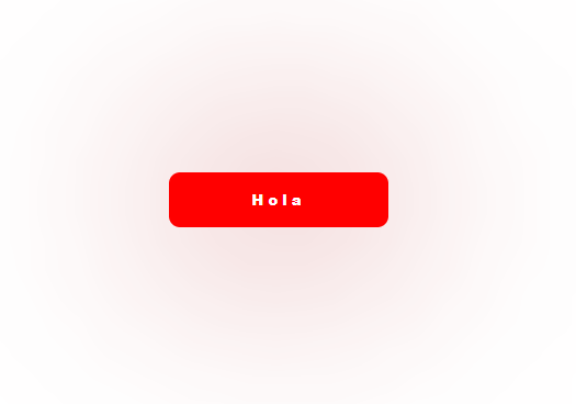
box-shadow: 1px 1px 200px #bb3030: Creates a large, red shadow around the button when hovered over, giving a glowing affect.
color: #fff: Changes the text color to white on hover.
border: none: Removes the border when the button is hovered.
Pseudo-Element for Hover Effect (.type1::after)
type1::after Styles
.type1::after {
    content: "";
    position: absolute;
    left: 0;
    top: 0;
    transition: all 0.5s ease-in-out;
    background-color: red;
    border-radius: 30px;
    visibility: hidden;
    height: 10px;
    width: 10px;
    z-index: -1;
}
content: "": It creates a pseudo-element without any content, but it is styled.
position: absolute: Positions the pseudo-element relative to .button (its container).
transition: all 0.5s ease-in-out: Ensures a smooth transition when properties change.
background-color: red: Sets the background color of the pseudo-element.
border-radius: 30px: Makes the pseudo-element Circular.
visibility: hidden: Hides the pseudo-element initially.
height and width: Sets the initial size of the pseudo-element.
z-index: -1: Places the pseudo-element behind other content (like the text).
Hover Effect on Pseudo-Element (.type1:hover::after)
type1:hover::after Styles–
.type1:hover::after {
    visibility: visible;
    transform: scale(100) translateX(2px);
}
visibility: visible: Makes the pseudo-element visible when the .button is hovered over.
transform: scale(100) translateX(2px): Enlarges the pseudo-element significantly (creating a “filling” effect) and slightly shifts it horizontally to enhance the effect.
Key Components
- Reset Styles: The universal selector
*andhtml, bodyrules remove default spacing and set a consistent box model and full viewport size. - Centering Elements:
#areausesposition: absolute;andtransformto perfectly center the content. - Button Styling:
.buttondefines the button’s size, border, color, and transition properties for hover effects. - Hover Effects:
.button:hoverand.type1:hover::afterstyles create visual effects when the button is hovered over, such as changing colors, applying shadows, and revealing pseudo-elements. - Pseudo-Element Usage:
.type1::afteris used for advanced hover effects, such as expanding a background from a small point to cover the button.
This CSS setup is designed to create a modern button with smooth hover effects, centered on the screen. The use of transform, transition, and pseudo-elements like ::after allows for creative and interactive designs.
Result-

Conclusion
Adding interactivity with hover effects: To make your button even more engaging, you can add hover effects using CSS
With hover effects, you can change the appearance of the button when a user hovers their mouse over it. This can include changing the color, size, or adding animations to make the button more interactive.
By following these steps, you can create a visually appealing button with HTML5 and CSS3 that will enhance the user experience on your website. With practice and experimentation, you can create buttons that not only look great but also contribute to the functionality of your web projects. So, roll up your sleeves and start creating buttons that will make your website shine!
